For many online brands and businesses, Pinterest is their primary traffic source! Even if you have hundreds of followers, you may not be bringing in the kind of audience your website needs – all because your Pinterest artworks aren’t standing out amongst your Creating the right Pinterest graphics goes beyond just “looking pretty”, your Pinterest graphics need to get the right attention among your audience’s busy Pinterest feeds, look visually appealing and also keep its style relevant to your content and your Just follow these 5 easy tips and you’ll be designing amazing Pinterest graphics in no time.
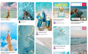
1. Vertical Pins


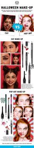
The most important point in designing your Pinterest artworks. Vertical images stand out and appear larger in the Pinterest feed, which means that even if your graphic does not look good, it will still stand out above the prettiest horizontal The Square and horizontal pins are too small to be noticed as compared to the vertical pins. We normally make the size of our vertical graphics around 800 x 1200 pixels but if you’re creating an infographic you can make it even longer!
2. Attention-Grabbing Text

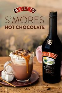
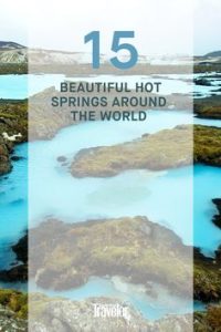
Large text is important for designing Pinterest graphics that stand out, Pinterest is a visual search engine and by ensuring your text is bold and easy to read, increases your likelihood of you standing out amongst competing pins. Just make sure your background and text colors have enough contrast, and that your font is bold enough so that your text easily stands out. Make it as easy as possible to look at your image and understand what it’s about!
3. Set Yourself Apart from your Competitors

The most difficult but most crucial point to implement. You’ve probably noticed that the majority of Pinterest graphics have all taken on a similar design trend and are all looking more and more alike, that’s okay if this style matches your brand, but if you can come up with a Pinterest graphic that people haven’t seen before they are more likely to notice it. When it comes to your Pinterest feed, Uniqueness will pay off more than anything else.
How can you do this?
Use organic shapes or new angles, different colors, textures, etc. to break up your Pinterest feed you can also use quirky accents that will grab people’s attention.
Make your pins simple and extra-long so they stand out from other heavily designed graphics.
4. Use On-Brand Styling
Using on-brand fonts and colors increases your brand awareness. By using consistent brand elements, your audience will associate your brand with your content and images and will be more likely to repin or click through to your content more repeatedly. People connect with brands they recognize, so make sure your brand can be easily remembered and recognizable!
These are the easiest ways to make sure your Pinterest design is consistent and effective, and it will also cut your design time in half!